Matchakin


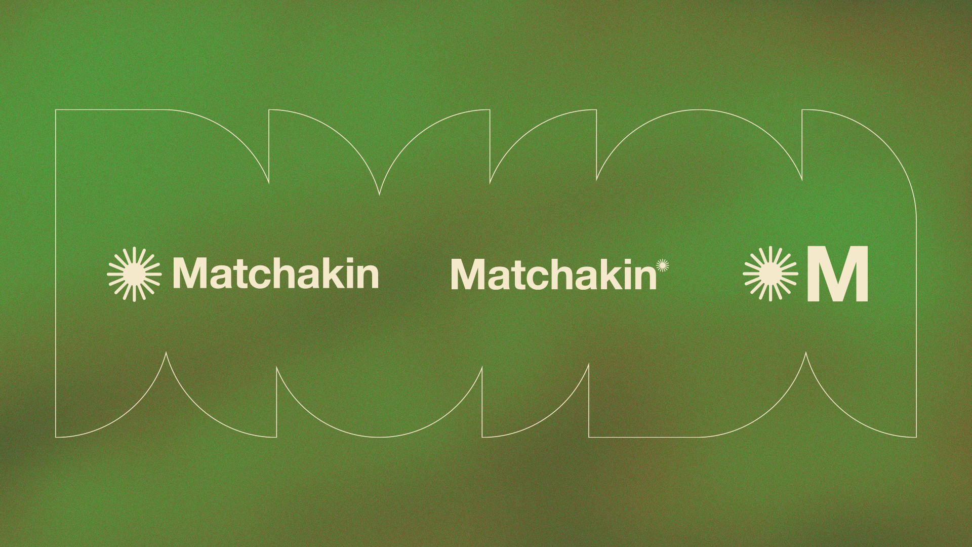
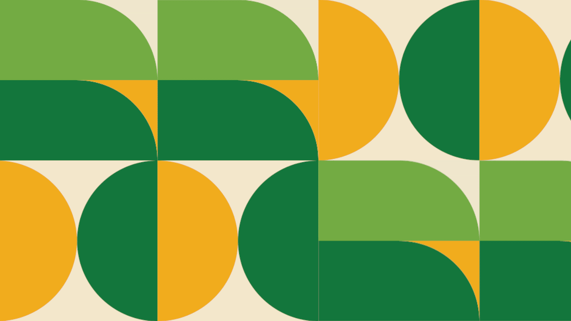
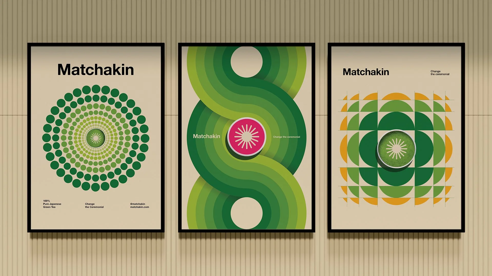
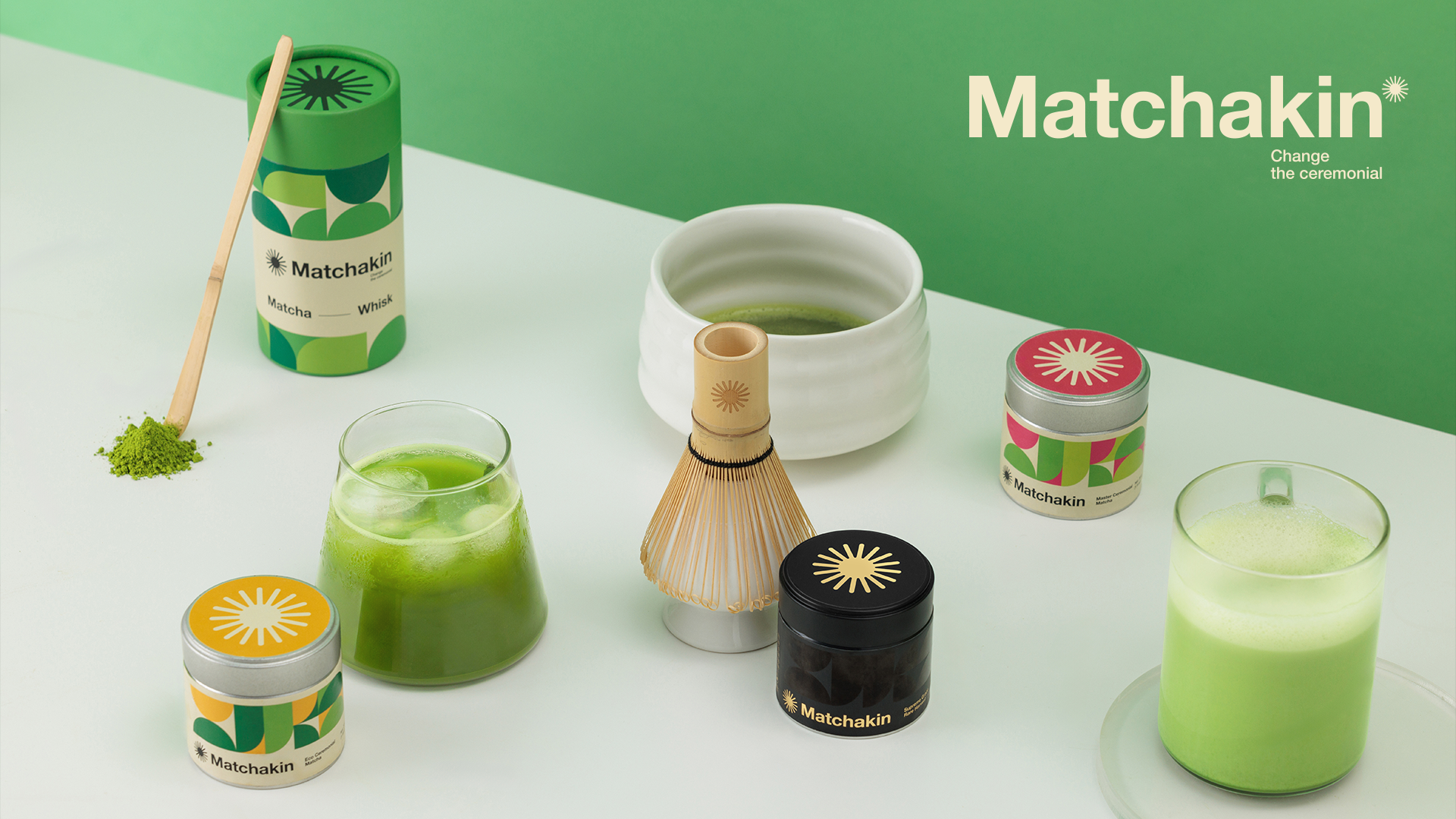


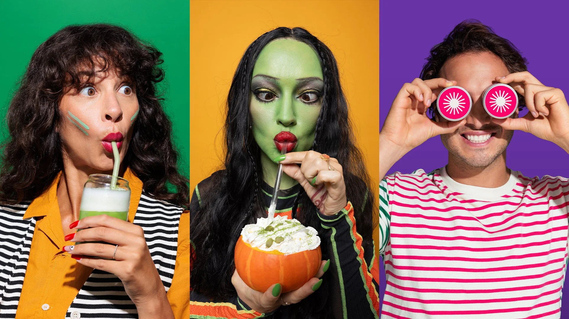
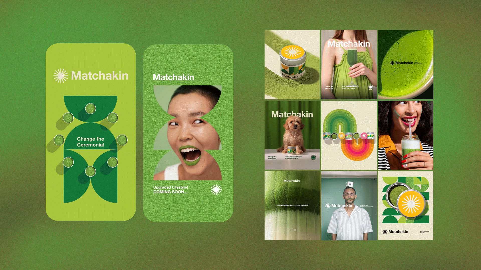
Matchakin’s design bridges Japanese tea tradition with bold modernity. The color palette leads with natural matcha greens to evoke freshness and purity, then expands with vibrant color to infuse playful energy—symbolizing creativity, community, and a new-generation ritual. Set in Helvetica, the typography is clear and confident, while sleek, tactile packaging adds shelf appeal with a refined edge. Through textured photography and subtle motion, the brand captures not just a product—but the feeling of a modern change the ceremonial.